


Full-color designs find their way into our inbox quite regularly, and sometimes even into our workflow. There are times that we tackle them as-is, and photographs that look modern on-screen come out like they were printed in 1920, because they were printed just as they would have been then, see? At other times, said full-color designs come from the most modern forms of designers: in this case a 3D & motion artist. With a little direction from our print concierge staff, even the most modern of design methods can convert to spot color almost seamlessly, with results that are just stunning.
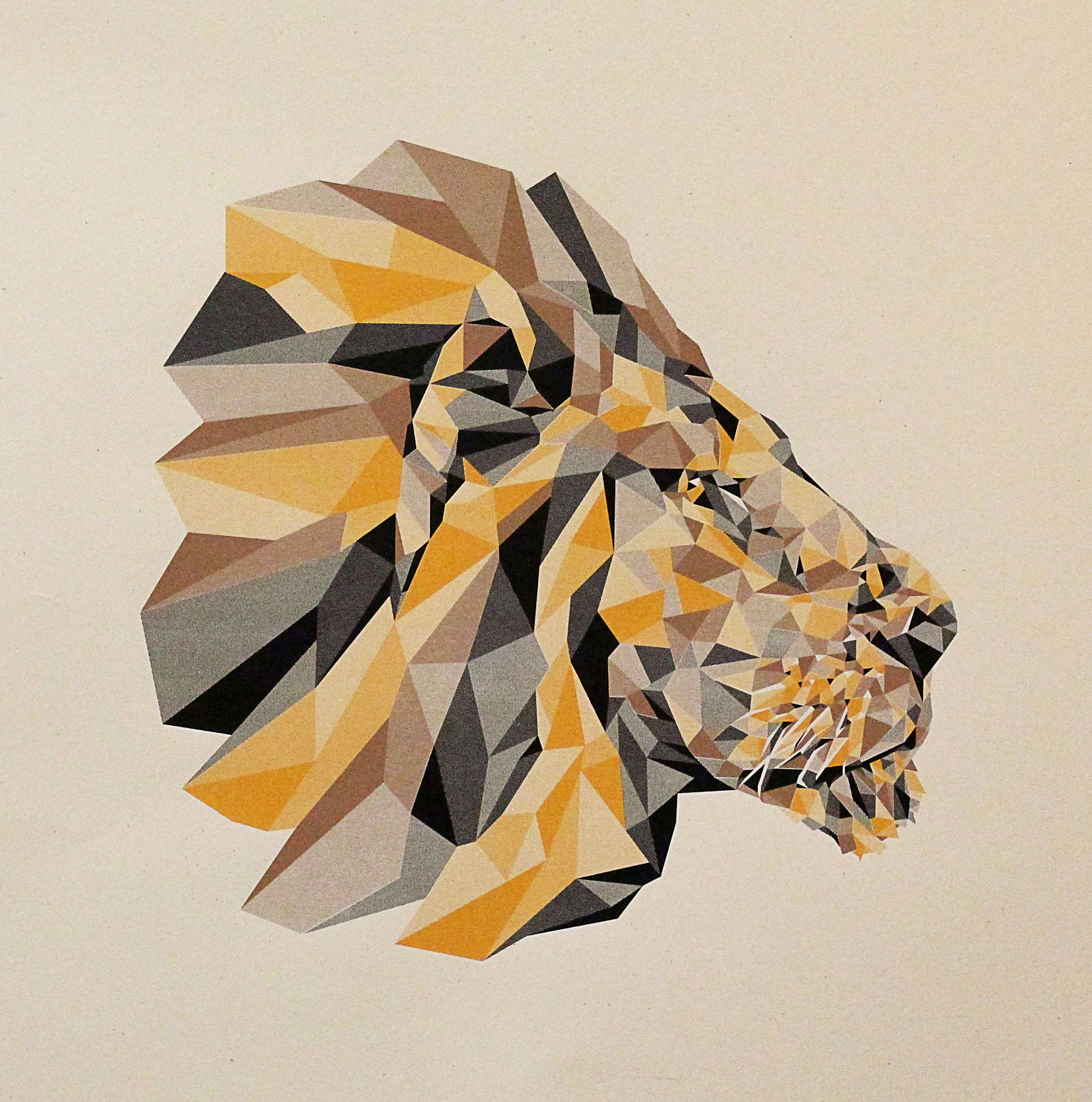
If you follow us on Instagram, we're sure you recently noticed the beauty of a poster, “Lion A," featured in our daily “What's on Press" post. This project was designed by Mancel Studios Founder & Creative Director, Mancel Lindsey. His Brooklyn-based creative studio specializes in motion design & animation that helps brands to grow equity & increase connection with their customers. Recently, we caught up with Mancel to get the scoop on this project, and what is coming down the pipeline for him in the near future.
What sort of design do you typically do on a day-to-day basis? What sort of designer would you consider yourself?
Most of my work is focused on motion design. I consider myself a storyteller and design allows me the space to develop my voice.
What made you choose to screen print this design?
I've been exploring different geometric based designs lately and really wanted to create something that bridged my digital process with a high quality handmade craft. Screen printing gave me an opportunity to simplify my motion design work, essentially moving from hundreds of frames in a video to just one. And screen printing's precision opened up a world of problem solving opportunities I just had to explore.
Did you anticipate to having to convert the art?
When I began playing with different shapes and techniques, I sampled a lot of colors from various images. I knew I would need to convert the artwork from 100s of colors to a few, I just didn't realize how difficult it would be to achieve the same color contrasts and 3d geometric look.
Did you already think it was spot color when you did it?
My process usually involves adjusting and layering colors until it feels right when working with motion design. So I actually had to do some research into what exactly spot colors were for and why they were necessary. Color and color grading is an aspect of my work that's more of an afterthought than a precise decision (unless working with a specific brand), like storytelling or animation. It can always be adjusted. Using spot colors and limiting my palette obliterated my comfort zone in this area.
How did you approach getting a quote? Were you asking if it was possible or were you just like, “How much to print this?"
I'm fairly naive when approaching new projects or ideas — meaning I don't really think about whether something can be done or not. So when I brought this project to Mama's Sauce I asked for a quote and sent over an early full color version. I also asked how the number of colors, print size, and paper type played into the cost.

Tell me a little bit about converting the art. Was it your first time doing something like this?
I spent a few days reworking the shapes and colors and decided to visually approximate and then organize colors into three layers - light, medium, and dark. I quickly saw how using a couple transparency values with each color gave me the contrast I was looking for, essentially giving me nine colors from three. I sent an email over to the Sauce asking about using transparencies and that's when I learned about halftones. It sounded like that approach might work and give me the look I was aiming for. I was a little skeptical as to whether or not the halftones would be precise enough. I decided that if it worked, it gave me the color variation I was looking for while allowing the highlights and shadows to remain consistent regardless of color choice.
What feedback did you get from us? What about tips? Did you use any resources on our site, or online?
In the beginning there were many unknowns and questions on my end. I just didn't have the frame of reference to understand what everything meant. I asked Brooks his opinion and insights regarding file structure, pros and cons of trapping, best use of half tone percentages, and relied on his expertise to help guide my final decisions with half tones and paper type. I think I read through the FAQ on the Sauce's site three times while comparing Google searches and soaking up quite a few screen printing video tutorials on YouTube. I was surprised to find that I learned more from interacting with Brooks and reading the FAQ than I did in my own research.
What was the most handy bit (or few bits) of info you got, and from what source?
More than anything, the learning curve of designing for a new medium taught me valuable lessons for future projects. I made a ton of mistakes and gained a new perspective and love for a really satisfying craft.

Where can we buy one?
You can purchase this and future prints at http://mancel.tv. Maybe we'll do a 3d print of this series next.
How do you see this project affecting your designing in the future?
This project was a test run of sorts for me. Creatively it was a huge success. I'm working on developing this into a monthly series of prints that will utilize this with slight variations unique to each subject matter. I really like bridging the gap between different art forms. For instance, I may write a short poem, then paint a visual interpretation in acrylics on canvas, and then animate an abstracted 2d or 3d version from the painting, and then create a 3d print of something iconic in the animation. I'd like to continue exploring what that looks like for all my projects regardless of their originating medium.
How much more do you know as a designer now?
I feel like I've demystified the printing process a bit for myself with this project. And for me those moments really open up my art direction's perspective and approach to new work.
“Lion A" is a great example of how the use of different halftone percentages can be used to pull off multiple shades using only a single color. For more information on the use of halftones in spot color printing, check out this section of our FAQ Page.