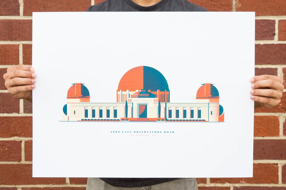
A series of three posters using the same Pantones and the same paper allow us to either gang them all onto a single run or share in some setup costs, like custom ink mixing. In this case the poster size itself had us run these posters one at a time, allowing us to leverage the ink mixing as a single common charge.
Down the Street Simple City Poster Series
| Designer | Down the Street |
| Project | 3/0 Screen Print Poster |
| Location | Los Angeles, CA |
Description
From the Designer
"This project was very important to us for a couple of reasons: 1. It was our very first set of illustrations that was brought from our computer screens to silkscreens and 2. We love Los Angeles and were so excited to bring these pieces to life.
Throughout this process we learned so much about prepping files for print and considering how our artwork would be affected as it was being converted. The folks at Mama’s Sauce were so helpful and patient during every step of the process and we could not be more grateful for their guidance and expertise. Shout-out to the folks over there that dealt with our novel-length email chain.
In the end - the posters were shipped to us (in California) and we were so impressed with the quality." -Down the Street (Colin Ozawa, Paul Zappia, & Remo Bangayan)
| Dimensions | 18" x 24" |
| Typefaces | Utopia STD Black Headline Museo Sans Rounded |
| Papers | French Construction Pure White 100C |
| Pantones | 7417U |
| Processes | |
| Approx. Print Budget | $990.00 — $1,210.00 for 150 |
| For Sale | Buy This |


