

? Design-wise
- 101 Design-Wise & Sauce 101
- 102 Our Services
- 103 What is spot color printing?
- 104 Letterpress: What it is & why choose it
- 105 Screen Print: What is it & why choose it
- 106 Foil Printing: What is it & why choose it
- 107 Mixing processes
- 108 File Setup Overview
- 109 What are our minimum and maximum print run capabilities?
- 111 What are our maximum print sizes?
- 113 What does 4/1, 4/4, 1/1, and so on mean?
- 115 How do I get a quote?
- 117 Requesting Press Checks
- 201 File setup overview
- 202 Artwork Template
- 203 Smallest point size that can print
- 204 Setting up type
- 205 Setting up colors
- 206 Multiple processes on one print
- 207 Bitmapping raster images to drop into Illustrator
- 208 Linescreening to get multiple shades from one color
- 209 Setting up a die-cut in your file
- 210 Setting up traps
- 211 Setting up color overlays
- 212 Setting up a blind deboss or emboss
- 301 Letterpress: What it is & why choose it
- 302 Letterpress terms: kiss vs bite aka deboss
- 303 Floods and color washes on letterpress
- 304 Mixing large color washes with type
- 305 Letterpress variance
- 306 Letterpress Ink Opacity
- 308 Metallic Letterpress Ink Opacity
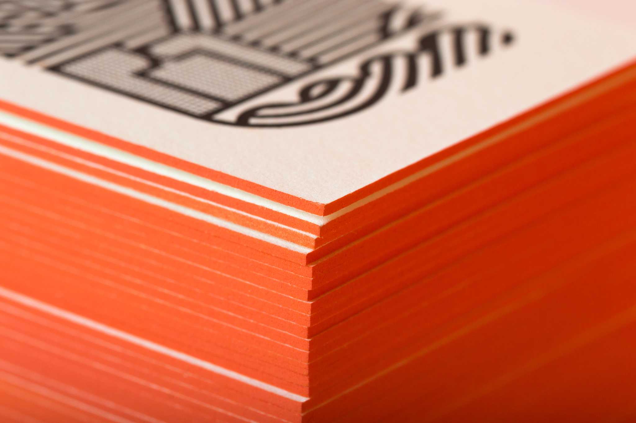
- 601 Paper Trimming General
- 602 What is kiss cutting?
- 603 Die-Cutting
- 604 Cutting Dies: Storage
- 605 Edge Painting
- 610 Debossing and embossing
- 614 Perfect Binding
- 701 What paper is right for your job?
- 710 Duplexed and Triplexed Papers
- 715 Gang runs and Flat vs converted stocks
- 902 Poster Design and the Screen Printing Process w/ Clark Orr & Creative Live
- 904 Leaving the Garage: The How & Why of Scaling Your Creative Business w/ Nick Sambrato
- 1001 Payment Policy
- 1003 Turn Around Times
- 1005 Rush Fees
- 1007 Shipping Carriers & Costs.
- 1009 International Shipping
- 1011 Damaged Package In Shipping
- 1013 Non-Satisfaction Of Print
- 1014 Graphic Design Service Terms & Change of Scope
- 1015 Shortages
- 1016 Screens and Letterpress & Foil Plate Storage
- 1017 Refunds
- 1019 Your Designs And Our Portfolio
- 1020 Designer's Guarantee of Ownership
- 1021 Returned Checks
- 1023 Pricing
- 1025 DISCLAIMER
#101
Design-Wise & Sauce 101

Design-wise is a learning database for designers to educate themselves on spot color print processes and designing for them.
Sauce 101 is the high-level collection to get you started - the essential must-knows. After reading and watching this section you'll have a solid idea of what we do, and how designing for our processes is a bit different.
#102
Our Services
Mama's Sauce is first off a commercial spot color print shop. We utilize specialty equipment like letterpresses, screen print press, and hot foil presses to print for designers, agencies, stationers, and brands. We also do specialty finishing like die-cutting, edge painting, scoring, perforation, and just about anything else that can be done on our antique production equipment. Our substrate of choice is paper.
We also offer event experiences like workshops, speaking engagements, and conference experiences. Additionally we selectively work with brands to utilize our growing communication channels to reach our amazing design-minded audience.
Download our capabilities deck.
#103
What is spot color printing?
What is Spot Color? from Mama's Sauce on Vimeo.
Spot Color printing means that we actually mix the colors for your job and print them individually. If you have a yellow, a green, and a blue – each one of those is mixed and laid down as a solid color, rather than being printed using CMYK. The result is a beautiful display of color that has an authentic feel. Hot foil is also spot color, only it uses a transferable material rather than ink.
Printing colors one at a time really means just that. Here's a step by step of a screen print coming to life after each color has been laid down and dried.

#104
Letterpress: What it is & why choose it
See our letterpress print portfolio here.
Letterpress printing is a 550 year old relief process of print making that yields remarkable type and image results. In recent years it has become desirable to have a deboss in one's print, and when you see that, it's most often done on a letterpress. As it is a cast iron machine that literally punches your print into paper, we are able to control the depth of the impression on a sheet. There are many variables that come into play when we're punching into paper, such as – paper density, opacity, edge bleeding, depth, impression evenness, and so on…
#105
Screen Print: What is it & why choose it
See our Screen printing portfolio here.
Screenprint printing is a print process that is thousands of years old, yet shockingly viable today. A lot of uses today are for signage and shirts, but when applied to paper – wow is it lovely. It's great for short and long runs, as we reuse screens with your art, lessening the setup cost that comes with making plates. It's also great for putting light colors on dark papers, and amazing when it comes to large swatches of dense color. Read more in the Screen Print Detail entry.
#106
Foil Printing: What is it & why choose it
See our foil printing portfolio here.
Foil printing is plated, typically with a copper plate. It's done on a letterpress with a heating element, which transfers the foil to your paper. Copper plates hold great detail and Foil is great for covering dark papers with light foil colors. It also shines and shimmers.
#107
Mixing processes
Much of the work that we do mixes our processes to create unique pieces that could only be accomplished if we took an approach of leaning into our different processes strengths. Please read about and watch our videos about each process - letterpress, screen print, & foil to get to know their strengths. When you send in your quote we'll be ready to talk about if we should be mixing processes or not.
Some mixed process examples - click through to see some of their case studies:
Screen Print & Foil 


Letterpress & Foil


Letterpress & Screen Print

#108
File Setup Overview
This video covers setting up files with bitmapping hand drawn elements and placing in illustrator, preparing vector images, outlining type, as well as coloring your artwork with uncoated Pantones, sizing your artboard, naming layers, and setting up for a diecut. Skip around to the sections relevant to you, or we suggest grabbing some popcorn and watching the whole thing.
About File Setup for Spot Color Printing from Mama's Sauce on Vimeo.
#109
What are our minimum and maximum print run capabilities?
Our fleet our presses range from hand-fed treadle presses up to 8,000lb auto-fed presses. That is to say, while we love jobs that keep the presses moving for 100's of thousands of impressions, we are also able to produce short run editions, like 50-piece wedding suites.
Learn more about each process and press, and which is best for what.
#111
What are our maximum print sizes?
Letterpress up to a 18" x 22.5" sheets with a max print area of 15.5" x 18.85"
Foil up to 20" x 28" sheets with a max print area of 18" x 24"
Screen Print up to a 26" x 40" sheets with a max print area of 24" x 36"
#113
What does 4/1, 4/4, 1/1, and so on mean?
You might have noticed that when we post jobs we list numbers over other numbers... Well, these numbers like 4/1 and 4/4 refer to the amount of colors used in the printing on the Front/Back of your print. Because we primarily work with spot colors, we'll always assume that 4/0 or 4/4 means 4 spot colors on each side. In process printing 4 would mean CMYK (4-color process printing), with us however, you'll more than likely be requesting things like 1/0, 1/1, 2/0, and so on… As most spot color work is 4 colors or less. But hey, the sky's the limit. Each color you add requires another plate as well as another time through the machine. We print each color one at a time. It wouldn't be hand done if we didn't. If your print is 2/2 and you're using the same 2 colors on both sides, the cost is actually going to be less than if you use all or partly different colors… As you pay a 1 time mixing fee for each color. Yes, your inks are hand mixed.
Some examples...
1/0 Letterpress - notice only black ink on white paper. Nothing printed on the back, hence 1/0.
1/1 Letterpress. See how front and back are each green on white? 1 color over 1 color (1/1).
1/1 Screen Print. See how front and back are each black on chipboard?
2/0 Screen Print Sticker (with a kiss cut! #bonus) - see there is just black and red on white nothing on the other side), hence 2/0:
Just for fun, here is a digitally printed 4/0 process print. This is that CMYK stuff we were talking about above. Notice the millions of dots that make up the colors. This is not spot color printing. This job is from our secret case studies.. If you're looking for full-color, we are very selective about taking on that work:
And here is a 4-color process print we did on a letterpress (that's 4-times through the press)!

#115
How do I get a quote?
Go to quote form here.
or
See some case studies on your way to the quote form here.
We give you the second option because we've setup our site to be a gallery of work for you to browse for both inspiration and education. When you navigate to 'printing' on the site you will be able to filter the jobs in our portfolio by process. Many of these jobs will list the approximate budget with them. As they have filtered to your desired specs, this will help give you a rough idea of what budgets look like when printing spot color with us.* After you're down browsing, just click the "Request Quote" button in the Printing page navigation, which will take you to our quote form. If you don't know what processes you want to use we suggest browsing our Design-Wise database to educate yourself more on which process to use and why. You can also select "Not Sure/Suggest" a process when filling out the quote form.
*Keep in mind that every job is custom, so your job will more than likely not have the same price, but you will at least be able to gauge approximate cost.
#117
Requesting Press Checks
If our good fortune has it that we are in the same vicinity and you would like to request a press check please make sure to let your sales rep know. From there, once your job is put on our schedule you will receiving communication from the appropriate person in production about the day and time that your job will be on press.
As we are a production-based environment, it is important to note that we cannot easily move press check dates/times without it affecting our overall production schedule and potentially the due date for your order. If you would like to request a change in the date or time of your press check, you may be afforded a window in the initial scheduling communication to do so, and if it is possible to move your job we will make our best effort to do so.
Please note that if you are more than 15 minutes late to your press check that we will need to move forward without you, but we will still be happy to show you the job when you get here. All jobs are press checked by a manager so please know that your job is well cared for if you are unable to make it.
File Setup
#201
File setup overview
This video covers setting up files with bitmapping hand drawn elements and placing in illustrator, preparing vector images, outlining type, as well as coloring your artwork with uncoated Pantones, sizing your artboard, naming layers, and setting up for a diecut. Skip around to the sections relevant to you, or we suggest grabbing some popcorn and watching the whole thing.
#202
Artwork Template
Download this template to help guide you through submitting your files for print.
#203
Smallest point size that can print
ALL PROCESSES
.35 pt is the smallest line you'll want to use. Yes, halftone plates and screens use finer dots than that, so you may wonder why a line can't be that small. It has to do with supporting infrastructure. Halftone dots are clustered together and form a solid foundation, so they are strong and withstand the impact on the letterpress or stroke of the screen print squeegee. In order for a line to hold on it's own it has to be big enough to do so, and .35 pt is the minimum weight we'll accept. If you submit art with smaller lines than this, one of two things will happen… 1) We'll kick it back to you and ask you to amp up the lines and resend or 2) Although we try to catch everything, there's a chance that we won't notice that your lines are too small and you'll run the risk of losing that part of the artwork. We don't guarantee finding every mistake in submitted art – so please submit your artwork ready to go and within spec.
#204
Setting up type
For vector-based type submit as an outlined vector. If you don't outline the type we won't be able to access your file.
For hand-drawn type that you scanned, it is now a raster in Photoshop. Bitmap it as you see fit (50% threshold, halftone, dither, etc…), save each color as a TIFF and then place it/them into Illustrator (unlinked).
Regardless of vector or raster, place your type on a layer that contains everything using the same color. Colorize it with the uncoated solid Pantone you want to use, and name that layer it's respective Pantone color.
This is covered in detail in the File Setup Overview video, which is the first entry in this File Setup section.
#205
Setting up colors
For colors, please submit your Pantone® values relative to the solid UNCOATED book, as if you're printing with the us, the paper you're printing is more than likely uncoated. For the color black, please just submit as 100% (or a percentage of K if you're line screening). Note that you can choose a Pantone® Black (like Black 2u, 3u, and so on…), but you will be charged a mix charge, whereas just 100% K is out of the can, so there is no ink mix charge.
DO NOT COUNT ON YOUR SCREEN FOR COLOR ACCURACY. There, we said it. Your screen looks different than our screens, and so on. The best way, strike that, the only way to know the color that you will be getting is to own a Pantone® book. Odds are that the actual Pantone® color that we will be mixing to looks nothing like what you'll see on your screen when you pick a Pantone® to color your art. Here's a side-by-side of a photo of our Pantone® book vs. a screen shot of the same color in Illustrator:
Use the desired solid uncoated Pantone® book built into the program to color your work. Make sure each color is on it's own layer, each named with it's respective Pantone® value with a 'u' denoting it is an uncoated Pantone book reference. i.e. Pantone® solid uncoated 280 would be on it's own layer named 280u. Make sure to see our section on bitmapping if you're working in Photoshop.
It is not possible to guarantee 100% PMS accuracy with the variety of stocks we use, as the paper affects color dry down, especially on black papers. You should also know that Pantone colors are a registered trademark of Pantone®, and being that we don't use Pantone brand inks, 100% matches cannot be guaranteed. Don't worry, we try hard to make sure the color is as close as humanly possible.
This is covered in detail in the File Setup Overview video, which is the first entry in this File Setup section.
#206
Multiple processes on one print
There may be an instance where you're printing with different processes on the same sheet and they may or may not use the same colors. If this is the case, and it's not a blind deboss over a screen print (see blind deboss entry), but rather just two processes on the same sheet, please add one additional bit of information to the layer names in your Illustrator file.
i.e. if you were printing 2-colors, both letterpress, you would name the two layers by their solid uncoated Pantone colors... Let's say "black 1u" and "162u". If you're mixing processes and the "black 1u" is letterpress and the "162u" is screen print, then name the layers "black 1u - letterpress" and "162u - screen print". It's that simple.
It's important to note that registration from one machine to another can be a concern, especially on fine type. For that reason we don't recommend post-debossing copy type.
#207
Bitmapping raster images to drop into Illustrator
A full video tutorial for this can be found in entry #201.
Just because we take our files in Illustrator doesn't mean that you can't print your hand-drawn artwork, or include hand-drawn amongst vector elements. If you don't want to vectorize your hand-drawn work by tracing it over in Illustrator or by live tracing it, then you'll want to make a bitmap TIFF file and place it in Illustrator. Here are those steps. Also, we recommend watching the File Setup Overview video for this execution as well.
Hide all layers but the one you're bitmapping -> Convert to grayscale -> Convert to bitmap (you will need to choose 50% threshold, halftone, dither, etc…) -> Save as a TIFF -> Place (do not link) TIFF into your Illustrator file -> Colorize the layer with a solid Pantone uncoated swatch & name the layer that color -> Repeat for each color.
The most popular bitmap methods:
These methods all basically interpret your art in relation to breaking down the highlights and lowlights of a single color. In this case the color is black -> seeing how you just converted your layer to grayscale. Don't worry, this doesn't mean that your print can only be black, it's just that the next step on our end is producing black films, so we need 100% solid colors. Converting to grayscale -> then bitmapping does that. Remember that you're going to drop this into Illustrator and re-colorize each layer in the next step.
So, the bitmapping step is all about finding a way to take any complexities of your raster design (gradients and varying shades within a single color) and make them translate to a single plate or screen. In other words – you've got to lose the grays. If you've ever zoomed in real close on type in Photoshop, you'll see that the edges are made up of varying degrees of black and gray. They're rasterized. All of the bitmapping methods will have to decide what to do with these gray edges. No matter which method, it will create not so sharp lines. This is why we go out of our way to recommend you doing your type treatment in Illustrator, where type is true vector. Go ahead, zoom in on a type face in there… No grays. Sharp! Anyways, off our soapbox and back to the how to do the bitmapping!
50% Threshold This basically keeps everything over 50% black and drops off everything under 50% black.
Diffusion Dither This interprets your degrees of blacks/grays by using single pixel dots.
Halftone Screen This option is a little more complex, as there are secondary choices. Frequency is your Lines Per Inch. Don't go any higher than 80 LPI for screen prints and no higher than 133 LPI for letterpress. Lower numbers make larger dots. Higher number make smaller dots. Please make sure to let us know what LPI (frequency) you chose. Angle and shape are up to you and your aesthetic. Angles are functionally important if you're doing a process print. If you're doing a process print, we'll be doing the line screening for you, so don't worry about that for now. Also note that there are some instances where halftones may not work on our end. If this comes up in your art, we'll let you know.
*always choose the same resolution that your document is currently in when bitmapping // lines per inch not lines per cm.
This is covered in detail in the File Setup Overview video, which is the first entry in this File Setup section.
#208
Linescreening to get multiple shades from one color
 Through the magic of halftones and texturing we are able to give the appearance of multiple shades of colors on a single plate (i.e. a single color)… This is next level stuff, but can help you get so much more a dynamic look from your print.
Note.
On screen print, we rip up to 80lpi, which is the equivalent of a very low detail offset. See the dot size we were able to hold on this screen print (if you're on your phone zoom in and see them dots).
On Letterpress we rip up to 133lpi, which is like a mid-level detail offset print. Check out how fine the dithering is on this letterpress print detail.
Now that being said, neither LPI is recommended for copy type itself, as it can muddy the clarify of the typography. If the dots are part of your desired aesthetic or if you're cool with the line screen in your title fonts, then go for it, but remember this isn't offset, which has a much higher LPI. If we're doing a spot offset run then line screening your copy type is a much more viable option.
Getting it done.
How you go about line screening your print can be fairly simple and we can help if you're looking for something as simple as a gradient in one of your layers.
BASIC.
WE DO IT – We don't provide design, but if you have one ready to go and unsure of the gradient to use, we can advise or even work on your file for you. Note that pre-press work is an hourly charge.
MORE ADVANCED.
YOU DO IT - You make your own custom line screens within our tolerances and produce the aesthetic that you are looking for, which can be done like the above approached, through making and, or by a million other ways. For example on a basic gradient - when you would build your vector-based print with the appropriate solid coated or uncoated Pantone in Illustrator, you take whatever image you want to be a lighter shade on the same plate and bring it's transparency down to the desired percentage… Like if you have a 1-color PMS 186u business card and want a 50% of that red on their as well, just take the part you want to be 50% (keeping it built with PMS 186u) and bring it's opacity down to 50%. Our rip will handle the rest. Keep in mind that even as high as 133lpi, visible dots will be produced! We would be more than happy to mail you samples or discuss your project on the telephone if you have questions or concerns. Now with this ACME example they provided the artwork already fully textured. Notice how much depth you can get out of 1-color.
This is a basic round halftone in black overlaying the red layer. Added a lot of depth, doesn't it?
RASTER IMAGES. If you want to accomplish tones and textures with raster images, make sure to read about placing bitmapped tiffs above. More than likely you'll want to follow the bitmap instructions for halftones. Make sure to let us know what LPI (frequency) you halftones at. Here's an example of a raster gone line screen:
AND THEN THERE WERE PLUGINS!
There are also 3rd party plugins for the Adobe Suite and ProCreate, like True Grit Texture Supply.
#209
Setting up a die-cut in your file
If you have a die cut shape we ask that you put it on it's own layer, the top most layer, in your Illustrator file. The layers below it should be the rest of your art, to specs as defined by our file submission guidelines. The layer should be named 'die line' and built as a 1pt 100% Magenta stroke. The cost is determined by the size and detail. The more detailed and/or bigger it is, the higher the cost. Dies have their detail limits, so there's a chance our sales team will make some suggestions for adjustments on your die that will make it feasible.
This is covered in detail in the File Setup Overview video, which is the first entry in this File Setup section.
#210
Setting up traps
Traps help make sure that the colors line up without a white gap between them. You can see one around the platform sign below.
See the darker hue of the red along the top of the guitar's body? That's another example of what a trap looks like.
If you do not trap a hairline registered screen print, you can expect subtle mis-registrations… Some people look for this to happen to their prints as an aesthetic, and that's fine by us – we love the character that the process gives prints, mis-regs included! But, that's not what everyone wants, so we always shoot for as close to perfection as possible, which trapping helps with. What are some of the reasons why the mis-registrations happen? Oh, so many! First off - we're dealing with paper and water-based inks. When the paper receives the ink, it's moisture, it can grow. So every color laid down has the ability to change the physical size of the paper. Being that in screen printing each color is laid down and dried prior to the next, you have a recipe for the paper to change size. Speaking of - there is also paper acclimating to the moisture in the air that can cause it to grow or shrinks. Add in hand feeding and the fact that the squeegee causes the screen to stretch to meet the paper when laying ink down... Well, you can see why we trap art.
Keep in mind that when you trap your files, you're basically overlaying ink on top of already dried inks, which provides a different surface than the paper for the inks to sit on. We can make the inks opaque (in most cases) or transparent – In the case of opaque traps, when the colors overlay you will be able to see a difference in the layer from where it hits paper to where it lays over other inks (see the next design-wise entry for more details on this). This will naturally cause the trapped area to show as glossier than any ink that's laid straight onto the uncoated paper. That is to say, keep your aesthetics in mind when trapping and overprinting inks! Requesting your inks matte helps reduce this effect. *So be warned that if you're used to hiding elements in your art underneath the elements that are on the top most layer, they will show (in the way explained above) in your print. To be very clear, IF THE ART IS IN YOUR FILE IT WILL PRINT. Also note that trapping is typically more applicable to screen printing than say letterpress or foil.
Letterpress is more of a hairline print process, so please don't feel that need to trap your project unless it is for aesthetics or advised to do so. Letterpress inks are transparent and 3rd colors will often result from traps and overlays. There are some exceptions, which we can chat about per project – black for one is more opaque than other colors and some sheets of paper may not allow for hairline printing… We'll call you about your project if this is the case.
Doing your own trapping? Please make sure to trap any hairline registered screen print, as screen printing isn't a hairline print process. We can trap your artwork at your request, which is an hourly charge. We can provide you an estimated price based on your art up front. Just let us know if you don't feel comfortable trapping your art yourself. If you are trapping your artwork, we would advise discussion the printing order with your sales contact at Mama's Sauce prior to starting that process, as we can help determine print orders based on many factors. This really shapes how a file is trapped.
#211
Setting up color overlays
Overlaying colors can be a great way to make additional colors on your spot color print without having to pay for the additional plate and runtime. If setting up for your file for overlays, please fully overlay the print ready art – don't create a new color on the file. Do, however, send along a proof that shows the color from the overlay. Note that colors created from overlays will almost never be exactly the color you're looking for, as variables such as your monitor's calibration, ink density, line screen we choose to make the print, color shifts on the press, print order etc… will affect how the overlay color turns out.
See a case study of this here.

The yellow on top of the blue makes the green; the red on top of the blue makes the burgundy.
![]()
#212
Setting up a blind deboss or emboss
Deboss and embosses go on their own layers, regardless if they're intended to be a blind print or intended to deboss a previously printed color. If you're debossing several colors and they're on the same side of the sheet, then we'll deboss them all at once – so just build the vector overlay on a single layer. And that's exactly what it is, a vector overlay. Create the shape that is overlaying the printed art and make it the top-most layer in your Illustrator file, name it 'deboss or emboss' and make that layer 100% Magenta. Make sure to expand the shape, and that it is clipping mask-free when you send it. And there you go.
Read about what debossing and embossing is their capabilities in our Finishing section.
Letterpress Detail
#301
Letterpress: What it is & why choose it
About letterpress Printing from Mama's Sauce on Vimeo.
Letterpress printing is a 550 year old relief process of print making that yields remarkable type and image results. In recent years it has become desirable to have a deboss in one's print, and when you see that, it's most often done on a letterpress. As it is a cast iron machine that literally punches your print into paper, we are able to control the depth of the impression on a sheet. There are many variables that come into play when we're punching into paper, such as – paper density, opacity, edge bleeding, depth, impression evenness, and so on…
#302
Letterpress terms: kiss vs bite aka deboss
"Bite" is a term some people use for the depth of impression a letterpress print makes into the paper. We most often refer to it as a "deboss" though. Originally, letterpresses were not intended to bite into the paper, but rather "kiss" it, that is, printing on top of the paper without digging into it. Somewhere along the way, more recent than not, people came to love having a deboss in their letterpress prints – this has arguably saved letterpress printing from extinction. If you have a preference of a deboss or a soft kiss, please make note in your quote request. Unless you specify what you're looking for we will use our best determination of what is possible while on-press. Knowing your preference in the quoting process can change things immensely as so many factors help determine how much bite is possible...
Read about setting up for deboss and embosses in the File Setup section.
Now this is what I call a bite!
#303
Floods and color washes on letterpress
Letterpress inks are not opaque. There, I said it. They're also old machines designed to print type. For these (and other more technical reasons) you have to consider the unique aesthetic that comes with designing large blocks of coverage for letterpress prints. Keep that mind as you design for letterpress. Beyond the patchiness of the color washes it is also typical for the non-printed area to "ghost" and show up in the color wash. All that to say, unless you love the aesthetic and are ok with it's flaws - color washes for letterpress are not recommended. Here are some examples.

Click on this one to see it zoomed out to get an idea of what the wash looks like to the named eye from a bit further away.
To learn more about about some alternatives for getting a solid color in the background of your print but instead by using colored papers, please read our entry on paper for your job.
#304
Mixing large color washes with type
Know that full blocks of color and text on the same color plate is not ideal, as each requires a different delicate touch. Every color for every job is manually adjusted to yield the right result when it comes to the amount of ink needed to bring your art to life. If you want the best possible results in this scenario, text and large ink coverages should be their own plate if they are the same color and on the same side of the sheet. This allows them to run separately and therefore we can treat their needs individually. In this case, even though the same color, if run separately they would be treated and priced as two different colors. If the comp you send with your quote request has large blocks of color and fine type on the same color/plate we won't be bashful about suggesting this approach, but plan ahead. #KnowingIfHalfTheBattle
Here is some type mixed with a color wash on the same plate:

#305
Letterpress variance
As some of our presses are approaching 100 years old, each square inch on everything from the rollers to the platens and so on have lives of their own. This creates a variance in the final product across any run that we (and most of the letterpress community) feel ads character and life to a job. With that in mind, know that each print will have subtle variances. We can assure you that when it comes to consistency across letterpress print runs, we are an industry leader is consistency.
#306
Letterpress Ink Opacity
If you peruse our letterpress printing portfolio specifically you'll notice very little letterpress printing using light inks on dark papers. This is because letterpress inks are transparent; they are formulated to work best on white paper.
There are some exceptions, like using a dark ink on a not so dark sheet, like this brown letterpress ink on light green and light pink papers.
The most opaque letterpress inks are metallics. You can technically print metallic silver on black paper, but you want to make sure that you are into the aesthetic that it produces first and be fully aware that the ink will not shimmer like you're accustomed to seeing with other metallic inks.
For contrast here is white letterpress ink on an orange stock:

#308
Metallic Letterpress Ink Opacity
Metallic letterpress inks, while not 100% opaque, tend to be more opaque than the non-metallic inks like this silver metallic letterpress print on black paper:
Screen Print Detail
#401
Screen printing: What is it and why choose it?
About Screen Printing from Mama's Sauce on Vimeo.
Screenprint printing is a print process that is thousands of years old, yet shockingly viable today. A lot of uses today are for signage and shirts, but when applied to paper – wow is it lovely. It's great for short and long runs, as we reuse screens with your art, lessening the setup cost that comes with making plates. It's also great for putting light colors on dark papers, and amazing when it comes to large swatches of dense color.
Today we see the step by step behind the scenes of how Mama burns the screens for your #screenprint orders. Thanks @fctn_life for the #fctnhowto video.
A video posted by Mama's Sauce (@mamassauce) on
Another in the series of Sauce BTS & how we do what we do a la @fctn_life #fctnhowto - this time around: how we pull a screen featuring the #PeteSeeger print by @traskb
A video posted by Mama's Sauce (@mamassauce) on
#402
Screen print inks
We use water-based inks for screen printing on all of our paper printing, which is the last majority of the work that we do. But the ink is very durable, so much so that we even use it on vinyl stickers & woods. It is UV resistant and will stick to a variety of substrates.
It sits on top of the paper well:
It is great for clean light colored text on dark stocks:
While on the subject of the universe... The inks are great for outdoor stickers on vinyl - and our stickers have even been to space:
#404
Screen Print Overlays
Screen print inks can be mixed in a way that allows a third color to be made when overlaying two colors. If your project uses this technique it's important to remember that you have two options for color preference:
1. If you prefer to prioritize color matching of the two individual colors ahead of the overlay color, we cannot control the exact color of the overlay color.
2. If you prefer to prioritize color matching of the overlay color ahead of the two individual colors, the two individual colors may have to shift quite a bit in order to achieve the desired overlay color.
In either case, be sure to let us know a solid uncoated pantone value for the prioritized color match.
See more about color overlays and setting up files for doing so in entry #211 here.
Here's a Blog post about color overlays in more detail.

Foil Detail
#501
Foil Printing: What is it & why choose it
About Hot Foil Printing from Mama's Sauce on Vimeo.
Foil printing is plated, typically with a copper plate. It's done on a letterpress with a heating element, which transfers the foil to your paper. Copper plates hold great detail and Foil is great for covering dark papers with light foil colors. It also shines and shimmers.
#503
Foil Printing Type Quality

When transferring foil onto paper the type can only remain so "clean". When the heated foil releases from the paper it may leave a tiny bit of unwanted foil around the edges. This is a non-issue with most art, but should be noted when trying to achieve a clean type, especially small point sizes. For this reason you may find that our sales reps make suggestions for slight alterations to type or process to assure whatever quality you desire. See the examples below.
The effect is often very subtle like this job. If you look closely you'll see that the type, while pretty clean, does have a little character lent to it by the foil print process. Pay special mind to the edges of the finer type.
Same on these thicker lines.
When you zoom out a bit - it's not distinguishable.
You can see the same results on the finer type in this job.
And this one as well. See how the "Bell & Goose" read better than "Cheese", yet both look delicious, especially cheese. Always cheese.
Now you may be looking at the above and thinking, "This looks great, I don't know what you're talking about, Mama", and I agree. But for reference take a look at how crisp type can be with letterpress... Note that this print is just type and not sharing a big block of color on the same plate, which has adverse affect on type quality as you need to get enough ink on the plate for a large coverage of color, which can muddy up the type itself. Again, this is not the case with this example below. Just throwing that out there while we're at it.
Just for comparison here is white screen printed type next to black foil printed type.
It's especially important to note that every foil color / paper combination will have it's own unique outcome, just like how every letterpress color opacity level / paper combination will also be unique. Here's a white foil, which is traditionally very very fickle, printed side by side with a brown letterpress - both looking stellar.
Finishing Processes
#601
Paper Trimming General
Our equipment is old and the printing is hand done. Because of the multitude of factors that come with these processes, we really can't guaranteed more than a +/- 1/16" on prints and cuts. That's a margin of error of 1/8" - we use guillotine cutters as well as press with custom shaped dies to cut most of our paper.
#602
What is kiss cutting?
Kiss cutting is a form of die-cutting that we utilize on sticker sheets in order to allow you to release the sticker from and entire sheet.

#603
Die-Cutting
Die-cutting is the process of trimming a piece of paper into a shape on a press and not a guillotine cutter. Most paper is cut with a guillotine cutter, or paper sheer, which can only cut 90-degree cuts. If we want to cut a shape from paper, like a circle, packaging, or anything that's not a square or rectangle then we cut your job with a letterpress loaded with a blade that's shaped to your specifications. It works like a letterpress (in most cases it is a letterpress actually), only instead of printing we are cutting paper - so the rollers are removed and we use a cutting die instead of a printing die.


See more of our projects with die-cutting here.
#604
Cutting Dies: Storage
Projects that are die cut require a custom-made cutting die. When you pay for a project involving die cutting the cutting die cost is included. When re-ordering, if certain specifications have not changed (including sizing, layout, paper, etc...) we may be able to use the original cutting die which was already paid for. We will store cutting dies for up to 2-years to be used in these cases. Oftentimes a cutting die will become worn over time or another obstacle will keep it from being re-usable within 2-years. In those cases a new cutting die will need to be charged to you and re-ordered. We do our best to use your original cutting die without a re-charge for as long as we can within those 2-years.
#605
Edge Painting
Edge painting is exactly what it sounds like. We take the side edge of your project and paint a color of your choice on it. We can do Pantone colors, paper matches, gradients, and other specialty finishing. Note that you want a thick paper stock in order to give the color a proper canvas size to sit on.


#610
Debossing and embossing
A deboss is pushing the paper in, away from you - this is that texture people love with letterpress printing. You can either do it while laying down a letterpress or foil color, as they're both relief printing and use dimensional plates that we can press into the paper. This can be done with a color at the same time, over a pre-printed color, or blind deboss, which means there is no printed color.
An emboss is pushing the paper up towards you. It requires two dies, a male and a female. You cannot print a color at the same time. You can emboss over a printed color, or blind emboss.
Note that a blind deboss or emboss is still priced as a "color", as it requires a plate and it's own print time. You don't pay for ink or ink mixing though.
There are cases when you may want to emboss or deboss, either on their own or with a color. Let's say you want a dark stock with a light colored PMS print that feels like it was letterpress printed. We can do this with a foil stamp color that is available (metallic foils are best on dark stocks). Letterpress inks aren't opaque – so in this case if you want a light color printed on a dark paper, you will either need to foil stamp it with a color thats available, or screen print it (flat). We can not deboss or emboss a screen printed color after printing due to certain registration and printing limitations. The Foil stamped color and the deboss happen at the same time on press, so you will not need to foil stamp and deboss separately. There are advantages and disadvantages to both… As mentioned, let's assume the foil colors don't suite your fancy, your best bet will be to choose a screen printed color (flat).
Read about setting up for deboss and embosses in the entry #212.
Test time! Can you tell which is embossed and which is debossed on these prints? (hint! a few of them have both...)


#614
Perfect Binding
Perfect binding is a way of binding a book with glue where you wrap the cover around the interior pages to make a proper spine.

Papers General
#701
What paper is right for your job?
Paper selection is so important to us and we hope that it is for you as well. In an ideal world you've designed your project with a paper in mind, but if not, we're happy to help you find just the right one.
We categorize paper into two groups:
House stocks
We carry a wide range of house papers to help you from incurring excess shipping and logistic costs. Current house stocks are listed in the drop down of our quote form.
Custom stocks
Should your job require something not on our floor - be it from a line from one of our favorite mills or elsewhere just select a one of the custom options in the paper section of the quote form. We're more than happy to work with a paper that you have in mind.
You should know that every paper will give a design it's own unique life – so feel free to speak in descriptors if you're asking us to help you select your paper… sharp, deep, pillowy, washed out – whatever adjectives help get across the vision for your project.
Colored Paper vs Laying Down a Flood (wash) of Color
So your design has a flood of color in the background? Is it best to print that color or choose a colored paper? Well, that depends on a lot factors. The first thing to consider is - how specific is your Pantone value of that color wash? There's a chance that there is a paper that hits it, but more than likely there is a colored paper that is close. Is it close enough? That's your call. We can certainly recommend some papers that could work in the quoting process. Along the way we'll certainly have a recommendation on whether to use a colored paper or to print the color. Some of the reasons that we would lean one way or the other?
Budget Reasons
By knowing your budget in the quoting process we will be able to direct this choice along the lines of what is the best choice to suite your spend. An example? Sure! You may want only a small area of say, light blue ink and a large area of say dark blue ink. In many cases like this is the cost of the colored paper may be less than investing in all of the screen printing ink it would take to lay down the color, much like this example.

Aesthetic Reasons
Beyond the aesthetic choice of wanting an exact Pantone for your background area, there may be other aesthetic considerations to make when choosing a colored paper or not. See our entry on how color washes look with letterpress printing here and you'll see just how much printing a color can inform the overall aesthetic.
Technical Reasons
Solid color washes with letterpress can only be so big before the rollers run out of ink. There's one technical reason. Want another? Sure. Knocking out your typography from a black flood of ink won't yield as sharpe of type as screen printing an opaque white ink. Just look how sharp that can be.

As our good friend, Brian French of French Paper Company says, when you make a new art board go ahead and drop a paper color in the background first, don't try and squeeze it in at the end.
IMPORTANT NOTE ON DEBOSS ABILITIES VS PLATES. Cotton paper is made to be used well with polymer plates. The paper in this combo is a higher cost paper but the plate is lower cost. Now, you could marry the lower cost polymer plate with a lower cost pulp-based paper, but know that pulp-based papers are typically more dense. For that reason we suggest upgrading your plates to copper plates when using a pulp-based paper, which is more expensive than polymer but also will be more effective at giving you a deboss.
#710
Duplexed and Triplexed Papers
Duplexing paper = gluing two sheets of paper together
Triplexing paper = gluing three sheets of paper together
Why would you want to duplex or triplex your job? There are many reasons. Maybe you'd like different color papers on each side of the paper, or perhaps there's a color wash we were going to print on the back of the job but using a colored paper instead adds a level of production value. Maybe you want your print to be super thick, or have a 2-toned or even 3-toned edge is what you're after. There's even practical reasons to duplex a job on letterpress when you want to get deep impressions on two-sides of a print, coincidentally we would post-duplexing this case. Whatever the reasoning is, we'll help guide you into the right decisions for your project.
Depending on the job specifics we either glue the paper ahead of printing, which is called pre-duplex, or after printing, which is called post-duplex. Which approach we take depends largely on your design. Don't worry, you don't have to make that decision.


#715
Gang runs and Flat vs converted stocks
Nearly everything that we print is paper, most of it starts out on a parent sheet, which is most commonly 26"x40", and is trimmed into smaller sheets, printed, and then the final pieces are trimmed out. Many times we are "ganging" multiple pieces on your press sheets, either with the same art or multiple designs of yours that use the same colors and paper.
This is what a production sheet of ganged up greeting cards looks like before it's trimmed to final and scored:

One of the many great thing about our processes is that is allows you to print on pre-converted papers. An example would be coffee bags. If your order is big enough, we would pre-print it on sheets, like above, and then covert them into coffee bags after. If your coffee company hasn't gotten to the volume needed to justify that cost, our processes allow us to print on off the shelf, or pre-converted, coffee bags (or other packaging type - depending on your industry).


Or maybe it's a box that you need to create, if quantities are there for us to custom make your box, we could print on a pre-converted one like this one for example:

Or onto an existing journal:
Guest Classes
#902
Poster Design and the Screen Printing Process w/ Clark Orr & Creative Live
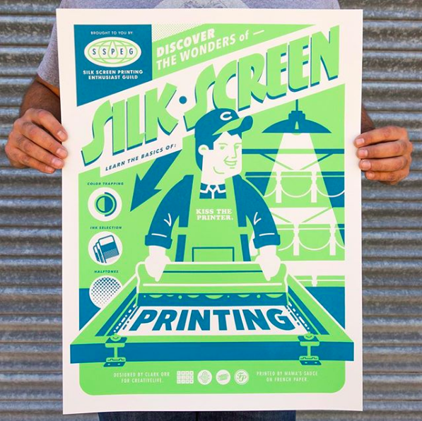
We partnered with Creative Live & the fabulous Clark Orr to put class together that's all about how to design for the screen print process. You'll hear from both sides - Designer (Clark Orr) and Printer (US) - as we work together to create and screen print a poster.
In this class, you'll learn:
- What screen printing is and how to design for it
- Choosing the best paper and ink for the job
- Best practices for preparing and delivering files to the printer
You'll also receive a version of this poster, a how-to infographic, you can print on your own. Interested in designing and screen printing posters but not sure how to get started? This class is for you.
Check out this amazing class here.

#904
Leaving the Garage: The How & Why of Scaling Your Creative Business w/ Nick Sambrato

Our Founder, Nick Sambrato, partnered with Skillshare to produce a class for up and coming creatives who are considering going on their own and "leaving the garage."
Do you have the hopes of growing your freelance operation from your garage or bedroom into a something more? Well, understanding the options and their implications are the first steps. Nick Sambrato, the founder of Mama's Sauce, will cook you up a high-level overview of scaling your creative business. Whether you're an individual freelancer, a mom-and-pop design shop or a small business owner, Nick will help guide you through the decisions and implications around healthy growth.
Diving into three crucial pillars — development, delivery and operations — this course is an exploration of how to grow from the "garage" on sound principles in a way that's right for you.
By the end of this 35-minute class, you'll have an understanding of the basic components of a business plan, how they apply to your vision, and most importantly be able to decide if what's on the other side of leaving the garage is right for you.
You can sign up for this class on Skillshare here.
Terms of service and policies
#1001
Payment Policy
All orders must be paid in full before order is placed. Payment options available for approved clients. To apply for an account, contact your sales rep.
#1003
Turn Around Times
Turn around time is the amount of time until the product ships. Each print will have it's own unique turn around time which will be given to you during quoting, however typically we're in this area:
- Screen Print 2-3 weeks*
- Letterpress 2-3 weeks*
Turn around time does not start when we start talking about it project, it starts when after you have approved your proof. Unless you have a terms-based account with us you will have already made payment as well.
Any additional pre-press or production beyond just the printing and cutting of your project will add time to your order. So know that the more boutique or intricate your job is, the longer it will take.
These turnaround times are based on our current workload and Mama's Sauce cannot and do not guarantee these turnaround times. If you would like to know a specific turn around time for your project please make sure to request that prior to placing your order. Any provided dates are subject to change, so make sure to approve the quoted project w/ quote turn around time within a day, as the provided time may change.
The only way to be sure that your order will be in when you need it is to pay for a hard ship date. Orders without a hard ship date assigned cannot be guaranteed. If you have an exact in-hand date, please call or email us first to see if it's possible to meet and if there is a fee associated with the in-hand date. NOTE THAT RUSHES REDUCE THE AMOUNT OF COMMUNICATION TIME WE CAN SPEND WITH YOU DURING YOUR JOB - BE DOUBLE SURE THAT YOUR ART IS SETUP TO OUR GUIDELINES.
Customer may be responsible for any expedited shipping charges associated with the order. If the turn around times fluctuate the respective productive will have the turn around time listed in it's description.
*Your project may have more processes on it than normal or more quantity than normal, so note that the bigger the order is in scope and processes the longer it will take.
***please see our DISCLAIMER to learn about the rare cases where turn around times are thrown out the window.
#1005
Rush Fees
A rush fee can be applied to your order if you need a guaranteed arrival date for your order. The rush fee puts you at the front of the line and we guarantee you get your product on time. The current Rush Fee is based on our current workload, the size of your order, and the date you need the order by. The rush fee does not include any additional shipping cost that may be necessary. In the event that we cannot complete your order in full we may ship a partial order to arrive on time with the remainder of the order shipping within 2-3 business days. If we cannot get at least 20% of your order to you by the due date we will credit your account with the amount of your rush fee (unless the delay is caused by the shipping provider). If the shipping amount paid is not sufficient to cover guaranteed expedited shipping of your order you may be asked to pay the additional shipping costs. If you cannot cover the extra cost of shipping you will forfeit your rush fee and your order will be shipped the quickest method possible. International orders are not applicable for guaranteed delivery date service.
#1007
Shipping Carriers & Costs.
We most often ship packages via UPS. They are the fastest and most reliable company we have ever used. All packages are shipped ground unless expedited shipping fees have been paid. Shipments are delivered Monday - Friday, 9AM - 6PM. Most deliveries and all overnights require a signature so please plan ahead for this if your order is rushed. UPS does not deliver on weekends (with the exception of overnight Saturday deliveries).
Buyer is responsible for shipping fees and will be invoiced once the shipment is made. By moving forward with your order you are agreeing to pay for shipping fees upon receipt of the shipping invoice. Should you want a rough estimate of shipping costs on your order email us and we'll do our best to get an estimate, every order is custom so it will be an estimate.
#1009
International Shipping
We do ship internationally Like any other shipment, you'll be charged the actual shipping costs and agree to pay for them once invoiced. For international shipping we may hold packages for shipping payment prior to sending.
#1011
Damaged Package In Shipping
All items that we ship are insured and a claim must be filed with the carrier to be compensated for items damaged during shipping by you, the client. We do our best to package your product for safe shipping, but sometimes mr./ms. shipper can be super rough on packages. This is not our fault.
#1013
Non-Satisfaction Of Print
We do whatever we can to make sure you are more than satisfied with your prints. We want you to understand the product you are ordering before you make your purchase and that is what this page is for. We want you to be happy, but if you are just generally dissatisfied with your product because you did not completely understand the service then we cannot do anything about that. We believe we accurately portray the quality of our products and services and are completely honest about every aspect of them. Any instances where the printing falls below standard is handled on a case by case basis, but we don't ship prints that we do not believe in.
#1014
Graphic Design Service Terms & Change of Scope
If we are providing you with graphic design services your invoice will has the specifics agreed upon in the terms section. Should you want to change the scope of the work (i.e. adding additional revisions, changing the deliverables, etc...) we will provide you with an updated cost for doing so.
#1015
Shortages
Your pricing includes spoilage and overages. We have a fairly uniform approach to the amount of pieces we print over by to keep costs down and waste less paper. The equipment we use is vintage and your prints are hand-made which means that waste happens, but we plan for it. If your project is more challenging, we add more overage for spoilage. This approach nearly always covers acts of the old press gods (the machines can have a life of their own), but there is the rare occurrence where the overage we plan on doesn't compensate for the waste that our presses produce - i.e. we find there is a shortage in the quality control process. Our standards are high, so we don't ship what we don't believe in. If the shortage falls within 4% of the product's total quantity, we will consider this acceptable, and the quantity will be noted for your records. In the instance that the shortage is over 4% you will be notified with options, most commonly:
Reprint the shortage at no additional expense to you
Add a credit for the per unit value to your account
Again, this is a rare occurrence. We're not happy when it comes up, but should it happen on your project know that we're on your side and we'll make sure things are made right.
#1016
Screens and Letterpress & Foil Plate Storage
Screens are reclaimed after each use, wiping off the art. We do not keep a screen with your art on it for future use.
Letterpress plates are made of recyclable polymer and are recycled after use. If you have a product that requires the same plate to be used over and over we will discuss using copper plates with you - please make sure to notify us that you intend to reprint.. When you pay for a project involving copper plates the plating cost is included. When re-ordering, if no specifications have changed (including name breakdown, layout, artwork, etc...) we may be able to use the original copper plate which was already paid for. We will store copper plates for up to 2-years to be used in these cases. Sometimes a copper plate will become worn over time or another obstacle will keep it from being re-usable within 18 months. In those cases a new plate will need to be charged to you and re-ordered. We do our best to use your original copper plate without a re-charge for as long as we can within those 2-years.
Foil stamped projects require copper plating. When you pay for a project involving foil stamping the plating cost is included. When re-ordering, if no specifications have changed (including name breakdown, layout, artwork, etc...) we may be able to use the original copper plate which was already paid for. We will store copper plates for up to 18 months to be used in these cases. Sometimes a copper plate will become worn over time or another obstacle will keep it from being re-usable within 18 months. In those cases a new plate will need to be charged to you and re-ordered. We do our best to use your original copper plate without a re-charge for as long as we can within those 18 months.
#1017
Refunds
Refunds, replacements, and account credits are handled on a per case basis. If you place an order and then cancel at any point in the process you will have two options to consider. A credit may be issued to your Sauce account for the total cost of the project minus any materials ordered or used as well as any time spent on the project. Alternatively, a refund may be issued for up to 75% of the project's value minus the cost of any materials ordered or used as well as any time spent on the project. We only ship what meets our standards and falls within parameters and expectations. Please contact us to discuss.
#1019
Your Designs And Our Portfolio
We reserve the right to display/use your work for our portfolio unless you request us not to. This includes using overages to send out to our prospective clients as printing samples. We also take photos to post on the Internet (instagram, blog, website, twitter, facebook, etc...) and we find that most people love the exposure. If we have your work posted online and you want any info blurred, we can do that as well. We reach out for appropriate usernames, hastags, & permission before posting photos of printing to our social networks.
#1020
Designer's Guarantee of Ownership
You, the designer and/or client, guarantee that the work that you are hiring us to produce is intellectual property that you own and are legally permitted to produce/reproduce.
#1021
Returned Checks
There will be a $45.00 returned check fee.
#1023
Pricing
Mama's Sauce has the right to change pricing without notice.
#1025
DISCLAIMER
Our equipment is OLD. Our processes are out of date. Because of this - the unexpected can happen! Not to say that it always does happen, but it can! If our press breaks, there is no press repairman. There are no stores just hanging around with parts. Also, sometimes modern designs exceed the limits of an old press and it takes revisiting the drawing board. Sometimes your art may not want to burn onto a plate properly, even though it's technically within spec. These things can and have happened. They're a lot like what your insurance company would call 'Acts of God'. If one of these acts happens during your job, be cool. Understand that your job is a lot like asking your grandpa to run a triathlon... Your gramps may be Banana George Blair, but he's still a grandpa. If there's an 'Act of Gramps' during your job, again, please be cool - we'll get it done when the old man is able to walk again. If you paid a rush fee to have your job done at a certain time and gramps breaks a hip, we'll refund your rush fee and continue on your job as soon as he's up and at 'em. Turn around times kinda go out the window when this happens, but we will always reach out to help reset expectations. Remember, you are hiring us to make art.